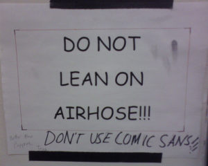
Let’s talk fonts. No, no, wait… come back. It’s fun, I promise. Well, it’s important, anyway. I mean, check this out:
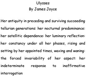
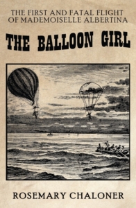
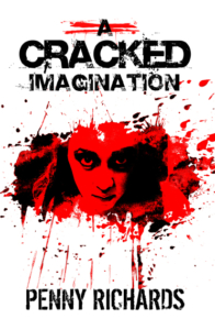
Now, if you were James Joyce and you’d sprung for a self-publishing contract, this isn’t exactly what you’d want, is it? It’s a detail that many, authors and readers alike, often do not consider, but the right font is essential to a book’s success.
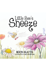
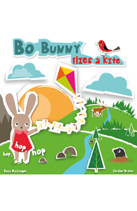
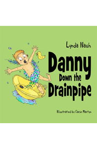
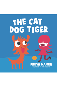
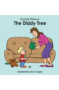
There are certain fonts that you’re used to seeing in certain contexts, and while you might not think about it consciously, when one wanders into the wrong book you can be sure you’re brain notices. Bearing in mind that ‘font’ includes variables such as line spacing and style, imagine, say, Stephen King set up like this:
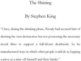
Weird, right? Sort of undermines the whole effect. That’s because we’re used to seeing wide line spacing like that in children’s books, to help young readers focus on the words. Or how about this:
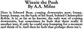
Dense, claustrophobic, intense… Probably not what A.A. Milne was going for when hewrote that particular piece. Now cast about you for the nearest professionally produced book. A Penguin classic or something. See the difference?
Don’t let your hard work be undermined by inappropriate stylistic choices. It won’t matter how much care and thought you’ve put into your writing if all a reader can think when they open your book of is ugh, Comic Sans… Drop Jelly Bean Self-Publishing’s experienced typesetters a line, and let us find the right clothes for your writing to wear out into the world…